

At Western Kenya Times (WKT), our identity is built around a simple but powerful idea: to observe reality, bring important stories into focus, and help people understand the world around them.
Our logo is more than a visual mark. Inspired by the structure of a camera lens, it represents our approach to journalism—looking closely at events, examining the details, interpreting their meaning, and presenting stories that matter to the communities we serve.
Just as a camera lens brings an image into focus, WKT brings people, places, issues, and experiences into the public conversation. We look beyond the obvious to uncover the context, perspectives, and human experiences that make every story worth telling.
The camera lens: Our way of seeing the world
The inspiration behind our logo is the camera lens, a tool for observation, documentation, and discovery. It captures the essence of what we do as a media platform: observe the world as it is, pay attention to what matters, and bring stories into focus.
For us, journalism is not simply about reporting what happened. It is also about understanding why it happened, who is affected, what it means, and what comes next.
Our lens is directed towards the realities of Western Kenya, where every community has stories to tell, voices to be heard, and experiences that deserve attention. We believe that important journalism can emerge from a village, a school, a market, a local government office, or an ordinary person’s daily struggle.
The circle: Stories are connected
The circular design of our logo represents the interconnected nature of stories and the communities in which they unfold.
No story exists entirely on its own. A decision made in a government office can affect a household in a rural village. A challenge in a local school can reveal a wider question about education policy. A community initiative can offer lessons that reach far beyond its immediate surroundings.
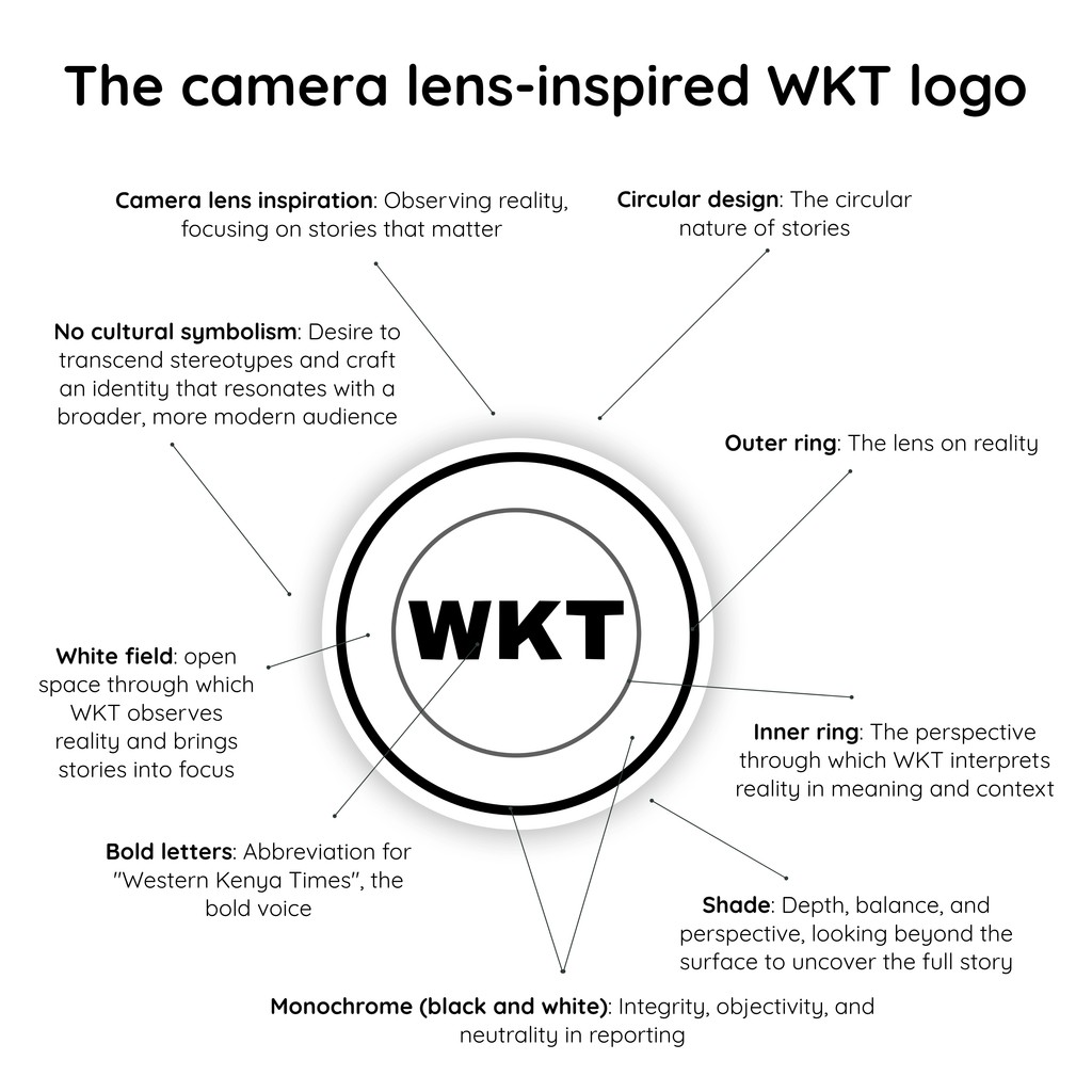
The circle reflects our understanding that journalism must recognize these connections.
It also represents continuity—the ongoing relationship between communities, events, institutions, and the people who experience their consequences. At WKT, we seek to connect these realities through reporting that makes local issues visible and helps audiences understand their wider significance.
The outer ring: Reality as our starting point
The bold outer ring represents the lens through which we observe reality. Journalism begins with the world as it exists: the events taking place, the decisions being made, the challenges people face, and the changes unfolding around them.
Our responsibility is to engage with these realities carefully, pursue the facts, question claims, and document developments that matter to the public.
We recognize that reality can be complex, contested, and uncomfortable. Our role is not to make every story fit a convenient narrative but to examine the evidence and provide audiences with information they can use to make sense of their world.
The outer ring therefore represents our commitment to staying grounded in facts while remaining attentive to the people and communities behind them.
The inner ring: Perspective, meaning, and context
Between observing an event and understanding its significance lies the work of interpretation. The inner ring represents the perspective through which WKT examines reality and gives stories meaning and context.
A headline may tell you what happened, but responsible journalism should help you understand why it matters. It should distinguish between claims and verified information, identify the people affected, and explore the circumstances surrounding an event.
This is particularly important in community journalism, where local developments can have far-reaching consequences for livelihoods, public services, leadership, and social relationships.
The white field: Space for every story
The white field surrounding the WKT initials represents openness—the space through which we observe reality and bring stories into focus.
It reflects our belief that journalism should make room for different experiences, questions, and perspectives. Communities are not defined by a single event, a single leader, or a single narrative. They are made up of diverse people whose lives and aspirations deserve to be understood.
We seek to create space for community voices, especially those whose experiences may be overlooked in mainstream conversations.
Whether we are documenting local development, examining public accountability, celebrating achievement, or telling a human-interest story, we aim to approach our work with an open mind and a willingness to listen.
The shade: Looking beyond the surface
The subtle shade surrounding the logo introduces depth and dimension to an otherwise simple design. It represents our commitment to looking beyond the surface of a story.
Behind every public announcement may be questions that require further examination. Behind every statistic are people whose experiences give it meaning. Behind every community challenge are circumstances that deserve to be understood.
Depth in journalism means asking follow-up questions, seeking different perspectives, examining evidence, and resisting the temptation to settle for the easiest explanation.
The bold letters: A voice that stands for something
At the center of the logo are the bold initials WKT, representing Western Kenya Times. Their weight and prominence reflect our ambition to build a recognizable, credible, and confident media identity rooted in the region we serve.
The initials are deliberately simple. They are designed to be memorable, adaptable, and distinct across our digital platforms, publications, graphics, videos, and other forms of storytelling.
Beyond their visual presence, they represent a voice: one that seeks to document the region’s realities, amplify its people, question matters of public interest, and tell stories that contribute to informed communities.
Our ambition is to ensure that Western Kenya is not merely a place where news happens but a region whose experiences, ideas, challenges, and achievements receive the attention they deserve.
Black and white: Integrity before appearance
Our monochrome palette is an expression of simplicity, clarity, and restraint.
Black and white create a visual identity that is direct and recognizable, without relying on decorative elements to communicate its purpose. The contrast gives the logo presence while keeping the focus on its central symbol and initials.
For WKT, this simplicity reflects an important journalistic aspiration: to put the story before the spectacle.
We value accuracy over exaggeration, evidence over speculation, and substance over appearances. We recognize that journalism must be willing to examine competing perspectives, scrutinize those in positions of power, and acknowledge complexity rather than force every issue into a simplistic narrative.
Black and white do not suggest that every story has only two sides. Instead, they remind us of the importance of clarity, honesty, and discipline in how we gather and present information.
Beyond the logo: The WKT philosophy
The WKT identity is ultimately about more than circles, lines, shades, or letters. It represents the kind of media organization we aspire to become.
We believe communities deserve journalism that takes their concerns seriously. We believe local stories can reveal important truths about society. We believe public-interest reporting should help people understand decisions that affect their lives. And we believe that meaningful storytelling can connect communities, challenge assumptions, celebrate progress, and encourage accountability.
Our work spans the everyday realities of Western Kenya—from the decisions of leaders and the performance of public institutions to the ambitions of young people, the experiences of families, and the initiatives transforming local communities.
As a digital-first media platform, we use the opportunities offered by technology to bring these stories to audiences wherever they are. But the purpose remains the same: to observe carefully, report responsibly, and tell stories that matter.
Our identity is also a statement of ambition. We seek to grow into a trusted and influential information platform that reflects the diversity of Western Kenya while maintaining a clear commitment to credible journalism.